The story behind our logo
The company’s logo is one of the essential components of its brand. It is a shortcut to the company’s core values. Therefore, it should not be an afterthought. Yet, at some point, we all make mistakes. We make assumptions about things that turn out to be wrong. One of such mistakes is assuming that Semblie wouldn’t be what it is today. There was never a lot of consideration when it came to the design of our logo. The logo was supposed to represent assemblies because that is what was intended to be done here mainly.
Some things are better left in the past
As the company grew, we found ourselves in need to get people familiar with our brand. The logo we had was impossible to use in single-color stencil prints and the logo mark was connected to the logotype which made it difficult to work with. We decided to make some modifications to help with this. This was not enough, but we were never able to find a good moment to do the complete overhaul.
Out with the old, in with the new
This year, Semblie celebrates its 5th anniversary. Finally, as we are now also entering a new office space and have plans to expand our team and capabilities, we think that the time has come to do something about this. Yet, we never considered what our logo should really represent. We understood that we need something that will reflect our core values. A symbol we can wear proudly. We needed a new logo but what should it look like.
We know what we’re doing, for whom, and above all that we are good at it, but what ARE our “core values”? What are the symbols that represent them? What should be the main inspiration for our new logo?
We are developing products, mainly electronic hardware. We do our best to be as agile as possible while maintaining the quality of our services as a top priority. This type of work requires a lot of innovative – out-of-the-box thinking to create something new, never seen before. It also involves a lot of forward-thinking to ensure future-proof solutions and hopefully fulfilling that ever-present expectation of tech disruption.
How do we communicate all of this to our customers in one simple symbol?
It might have been a sudden spark of static discharge in our workshop’s dry air or I’ve been just looking at the screen for too long, but all of a sudden I had it. With the newfound inspiration, I rushed to bleed this new idea onto the blank canvas of my computer. What I made looked really nice, albeit a bit complex and unfinished.
I showed it to a few colleagues at work and they liked it, so we decided to move forward in that direction.

But does it differ enough from other brands? How do we make it recognizable? What about the responsiveness? What about printability?
Some adjustments were made to deal with these issues, but we decided that it would be best to gather a few more opinions before we go public. Therefore, we created an internal poll with a set of questions that our team members answered and gave their honest opinions on the main issues concerning the design of the new logo. The results were mainly positive and some final polishing was done according to the gathered feedback.
To ensure that we have something that is recognizable in the digital world, yet easy for printing we decided to have two variations of the design. The monochromatic variation would be used mainly in promotional material.
One of a kind
We finally had something that we all liked.
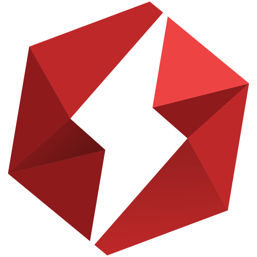
Our new logo illustrates breaking out of the box, breaking out of the egg, out of the norms, the regular. The origami-like folds represent our orientation to detail. This logo embodies our “electrifying” faster than lightning work. It represents the passion to create the best products of the future. It represents our will to create the future.
We hope that this logo will stand the test of time. The world is changing rapidly today, and we are trying to follow. That’s another thing we kept in mind while working on the new design. For this very reason, our new logo is even 3D, therefore it should be recognizable even in the possible future of Web 3.0 or wherever else the new emerging technologies lead us.

If at any point, while looking at this logo, you feel an urge to whip some llamas or you suddenly find yourself thinking about a certain faster-than-light superhero please consider seeking help from the nearest medical professional, as that could be an indication of a serious health problem.
Jokes aside, we hope that everyone will like our new logo the way we do. Please let us know your opinions.
About the author

Amar Glavić
The Designer
Amar is our Senior Product Design Engineer and resident "machine whisperer." With almost a decade of experience in the R&D trenches, he lives at the intersection of industrial design and hardcore engineering. Whether he’s navigating complex electro-mechanical integration or refining a prototype for mass production, Amar has a knack for taking a vague concept and turning it into a functional, market-ready reality that’s even better than you imagined.
S